Retail Analytics Mobile App
30+
8000+
Sensors deployed across world
Retail brands and malls
PLATFORM
INDUSTRY
Commercial retail
Mobile
TLDR;
OVERVIEW
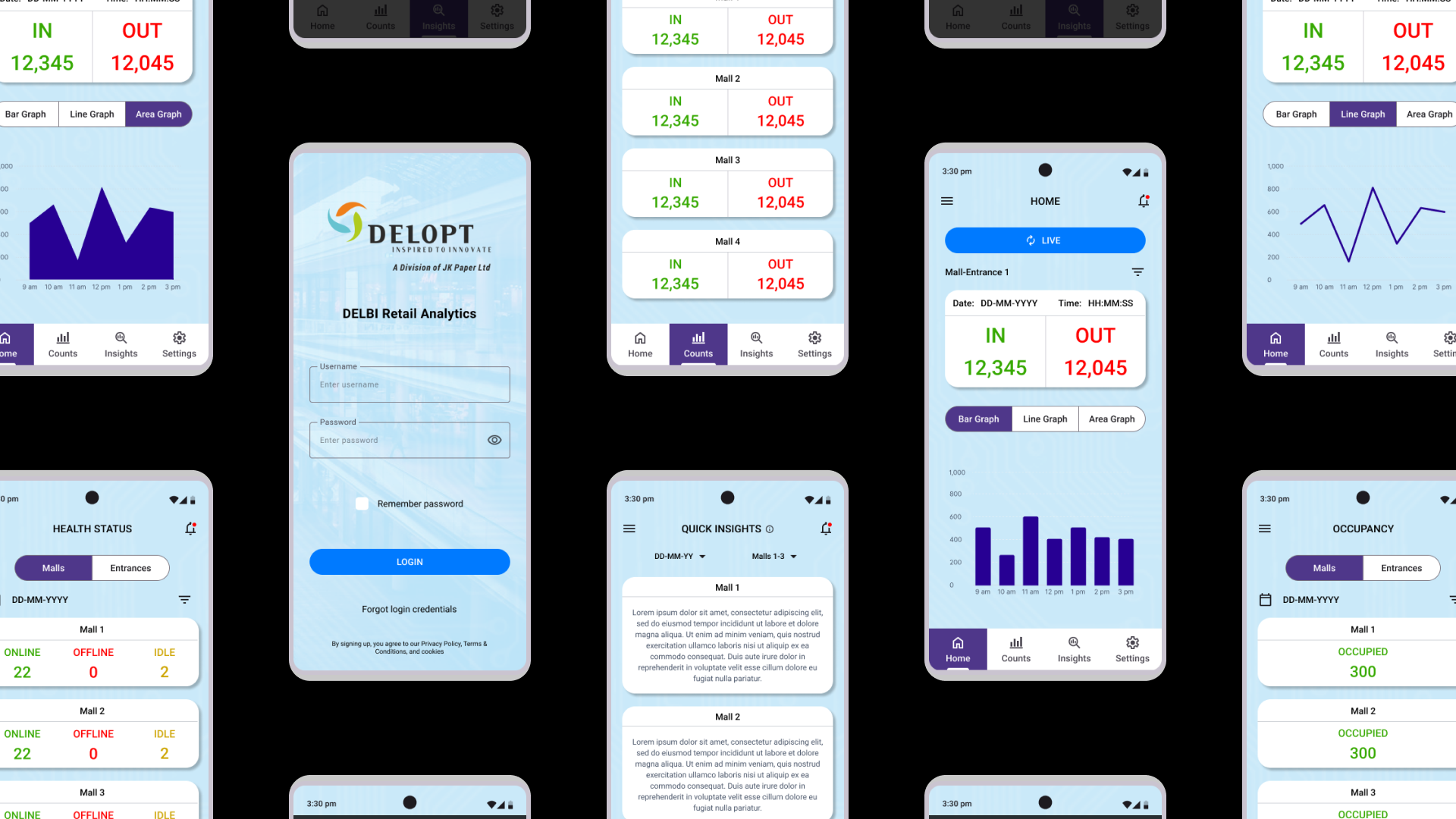
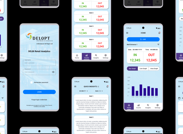
A mobile app for DELOPT's Retail Footfall Analytics customers to access insights and footfall data on-the-go. The app is intended to be a minituarized version of DELOPT's Retail Analytics platform.
DURATION
06/2023 to 08/2023 (3 months)
ROLE
Associate Product Manager, UX Lead
RESPONSIBILITIES
User research, user journey, user flow, visual design, wireframing, prototyping
PROBLEM
Mall management and retail store owners need an easier way to access footfall data, analytics, and insights since they cannot access their workstation at all times. Users need a quick summary of the insights to read through when required, and need an alternative way to access the analytics platform when their IT network is under maintenance.
REQUIREMENTS
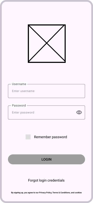
Login Screen
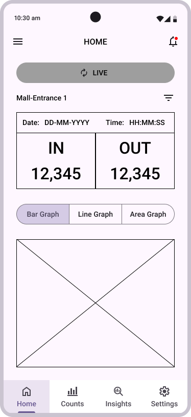
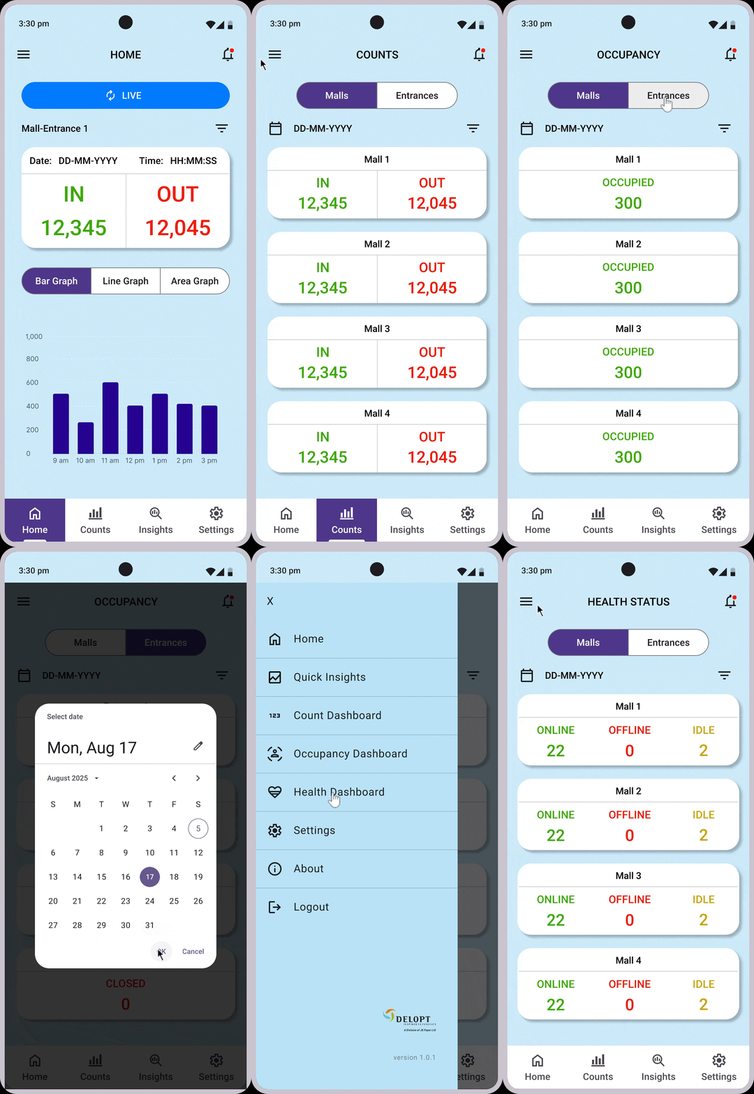
Homepage with Live Count data and graphs
Count Dashboard page
Occupancy Dashboard page
Device Health Status page
Quick Insights page
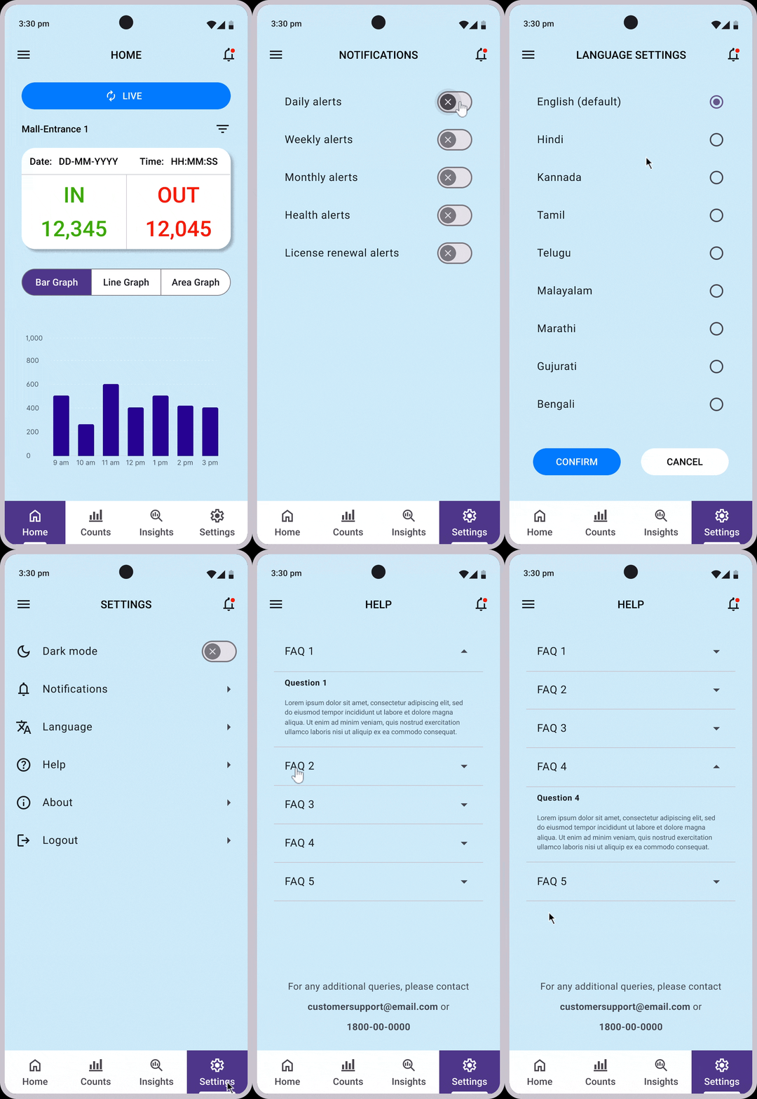
Notification Settings
GOALS
A mobile app that gives a feeling familiar to the usage of the DELOPT Retail Analytics desktop platform.
A color palette and typography that are easy on the eyes
Representation of the various dashboards in a simple and direct manner.
Summary of footfall analytics insights generated based on the store and date chosen by the user.
PROBLEM STATEMENT
DELOPT is a retail and defense tech company owned by JK Paper, a part of the JK Group conglomeration. The retail division of DELOPT focuses on monitoring the footfall in retail stores and malls, to help management identify visitor patterns and plan their business accordingly. The current platform only has a desktop browser variant and retail management requires a more accessible way to engage with the platform. The users also require a quick and concise summary of the insights and analytics that can be accessed with a few clicks.


>70%
Interviewed customers prefer to access their analytics and insights on their phone
60%
Interviewed customers would like to have a quick summary of insights to glace at when necessary
IDEATION
The research and interviews indicated that a feeling of familiarity was a key factor to help users feel comfortable using the app. A majority of customers aren't well-versed with analytics platforms and dashboards. Therefore an intuitive and minimalist design with a pleasant color palette was the end goal.
Color Palette
Typography
ROBOTO REGULAR
ROBOTO MEDIUM
Aa
The user journey was broken down into 4 core functions - onboarding, live footfall data, viewing historical footfall data, viewing a summary of the insights derived from the data.
The concept involved iterations around a simple UI with essential app modules like CTA buttons, date selectors, filters, and a burger navigation menu to access the most important features. The user flow was designed to be similar to the desktop platform but with fewer steps to satisfy the requirement of fast-paced access.
Based on continuous feedback, the final feature set for the app was decided as follows.
Login Screen
Homepage with Live Count data and graphs
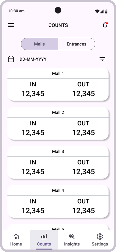
Count Dashboard page
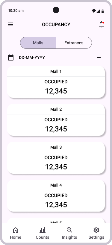
Occupancy Dashboard page
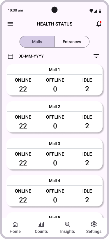
Device Health Status page
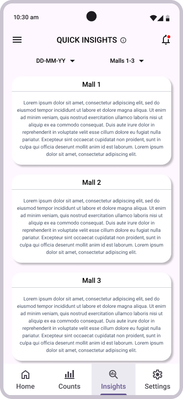
Quick Insights page
Notification Settings






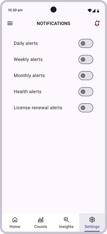


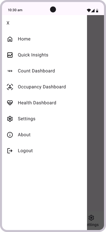
FINAL RESULT
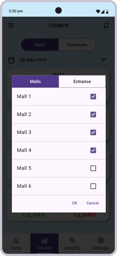
Upon multiple iterations of the wireframes and prototypes, the final mockup of the mobile app was completed. Multiple rounds of user testing were completed with both internal and external stakeholders to identify any gaps in the flow and design. The test results were satisfactory and relevant feedback was recorded for future versions.
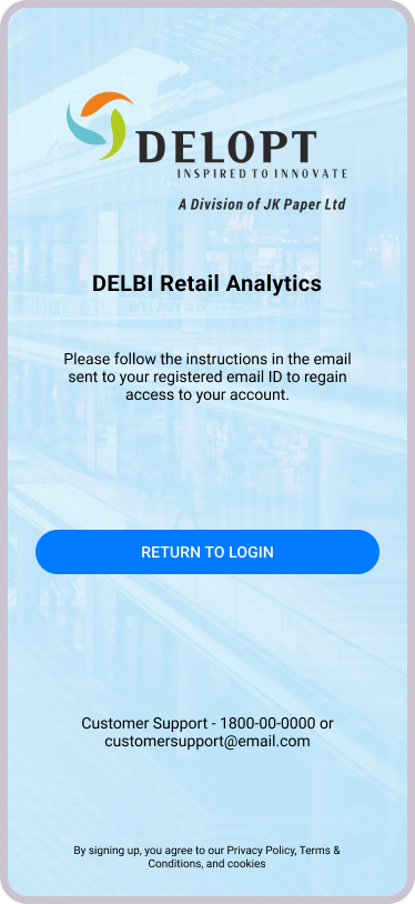
Based on early feedback, additional screens were included in the case of users not remembering their credentials. An option to force app updates was also included based on requirements from the development team.
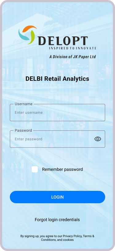

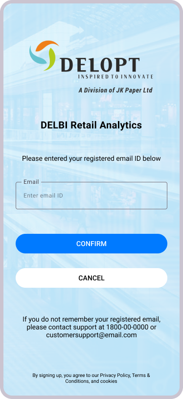






TAKEAWAYS
The research guided the selection of essential features that needed to be borrowed from the retail platform.
The user research showed that clients require different levels of personalization, ranging from entrances of stores to the entire store/mall.
The usability study showed that clients require access to historic data as well as live data, which led to the implementation of date filters.
The usability study showed that the "Quick Insights" section was required for historic data as well as present day's data.
NEXT STEPS
Implementation of accessibility features such as screen readers, high contrast mode, etc.
Improvement of AI-powered insights.
Increased customization - colour palette, metrics, etc.
Bhargav Sundara Rajan
Feel free to add me on LinkedIn or reach out via email for potential job opportunities, inquiries, collaborations, or just feedback in general.
Please let me know if you found me through this website! :)
