For Your Business - AI-powered Insights & Personalization
30+
Retail brands and malls
PLATFORM
INDUSTRY
Commercial retail
Web
15+
Retail performance KPIs
TLDR;
OVERVIEW
A design concept to implement an AI-driven personalization and insights feature for DELOPT's Retail Analytics platform named "For Your Business". The concept also includes a UI and color palette overhaul based on feedback from customers and stakeholders.
DURATION
08/2024 to 10/2024 (3 months)
ROLE
Associate Product Manager, UX Lead
RESPONSIBILITIES
User research, user journey, user flow, visual design, wireframing, prototyping, user testing
PROBLEM
The current DELOPT Retail Analytics platform only displays graphs and footfall count data. The user is forced to interpret the graphs and data to derive business insights. The platform also lacks a uniform color palette and typography, leading to poor readability and experience. There is also a lack of summary and analysis of data in the reports as well as the dashboard.
REQUIREMENTS
Login Screen
Homepage with Live Count data and graphs
For Your Business page with personalized KPIs
Add Custom Dashboard
Customized Dashboard
GOALS
Improve the UI elements of the platform by introducing uniformity in representation of data and color scheme
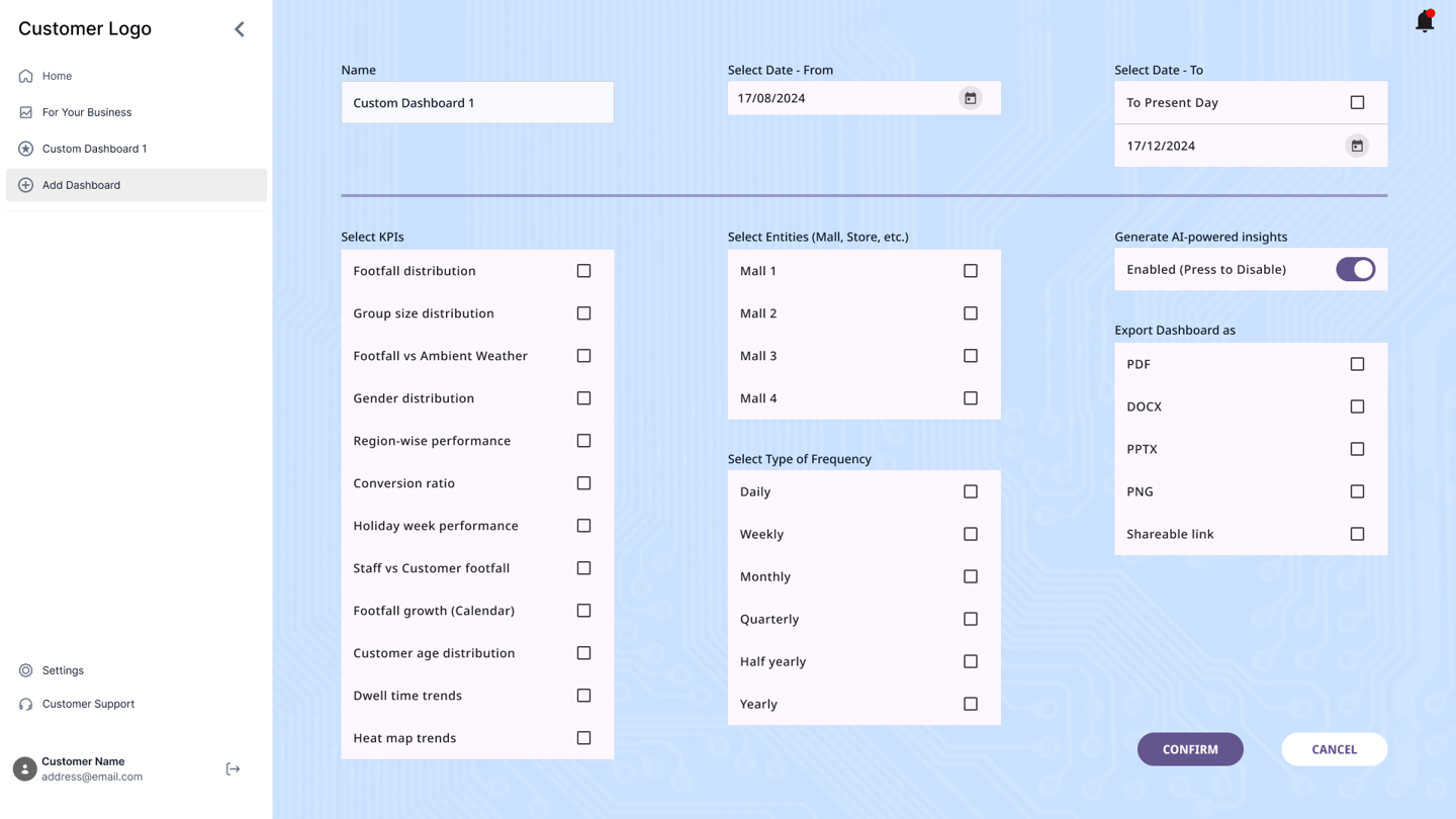
Provide an option to add custom dashboards that include specific KPIs that cater to the customer's business needs
Provide summaries and business insights based on the footfall data that helps the user in their business decisions
Identify KPIs that can be derived and analyzed through footfall count data
PROBLEM STATEMENT
DELOPT is a retail and defense tech company owned by JK Paper, a part of the JK Group conglomeration. The retail division of DELOPT focuses on monitoring the footfall in retail stores and malls, to help management identify visitor patterns and plan their business accordingly. The current platform only displays footfall count data and graphs without insights or interpretation of the data displayed. The user is forced to interpret and analyze the data to derive business insights. The readability of the platform is also poor due to a lack of uniformity in the color palette and typography. There is also little to no customization options for dashboards.


>92%
Interviewed customers expect the platform to provide insights and customization options.
70%
Interviewed customers were interested to pay for an AI-driven personalized business insights feature
IDEATION
The research and interviews indicated that a feeling of simplicity in using the feature was favored. A majority of customers preferred to be hand-held in the utilization of the new features and hence a minimalist intuitive design with elements that are commonly encountered on apps and websites was chosen. However, the re-design also ensured that the core look and feel of the platform was retained to not shock customers during the onboarding process.
Color Palette
Typography
NOTO SANS REGULAR
NOTO SANS BOLD
Aa
The user journey was broken down into 4 core functions - onboarding, homepage with count data and graphs, personalized insights, and addition of customized dashboards.
The concept involves using cards to display the essential data, with typography and color used to emphasize the important details in creating a uniform hierarchy of displayed information. 2 types of cards were used - a rectangular card for homepage display, and a square card to display personalized metrics.
In addition, some feedback is procured from the user in a simple manner - checkboxes, filters, toggle switches, and CTA buttons.
Based on continuous feedback, the final feature set for the app was decided as follows.
Login Screen
Homepage with Live Count data and graphs
For Your Business page with personalized KPIs
Add Custom Dashboard
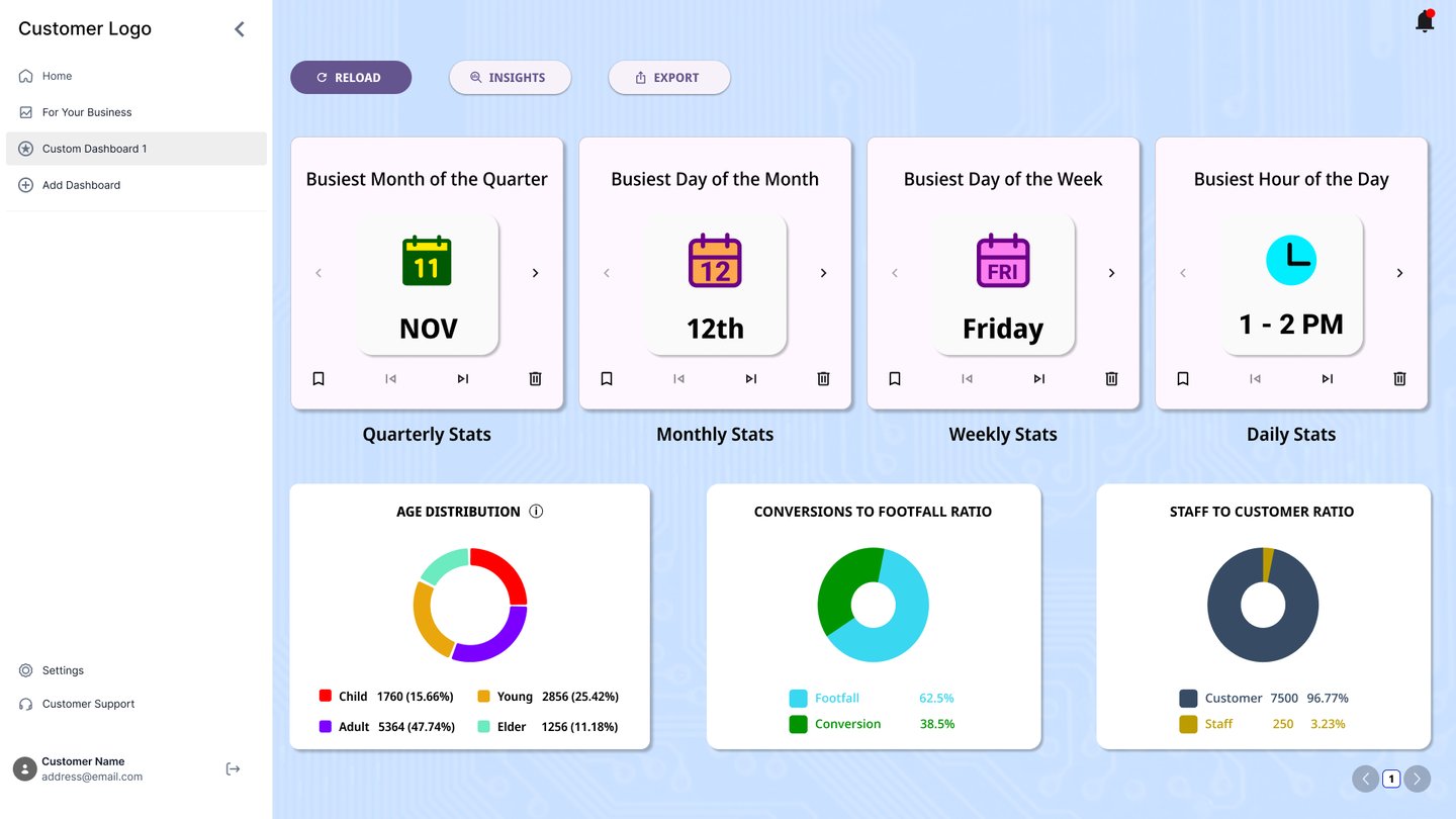
Customized Dashboard
LATO BOLD
Aa
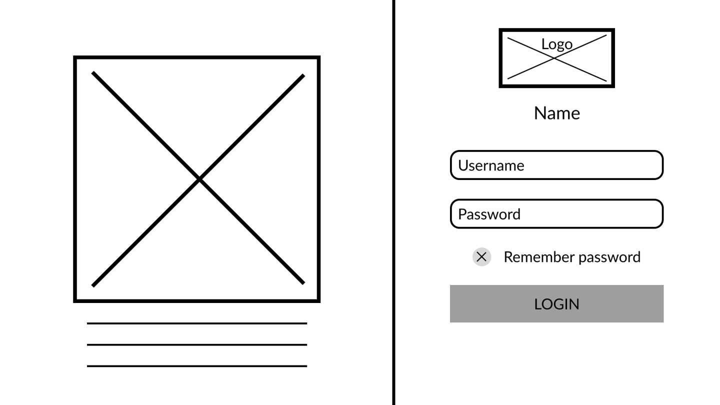
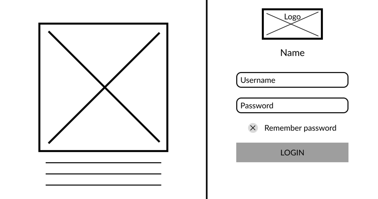
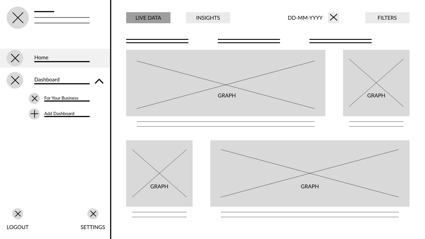

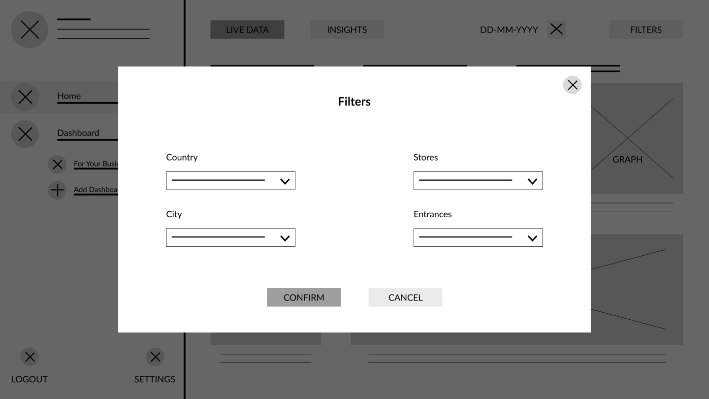
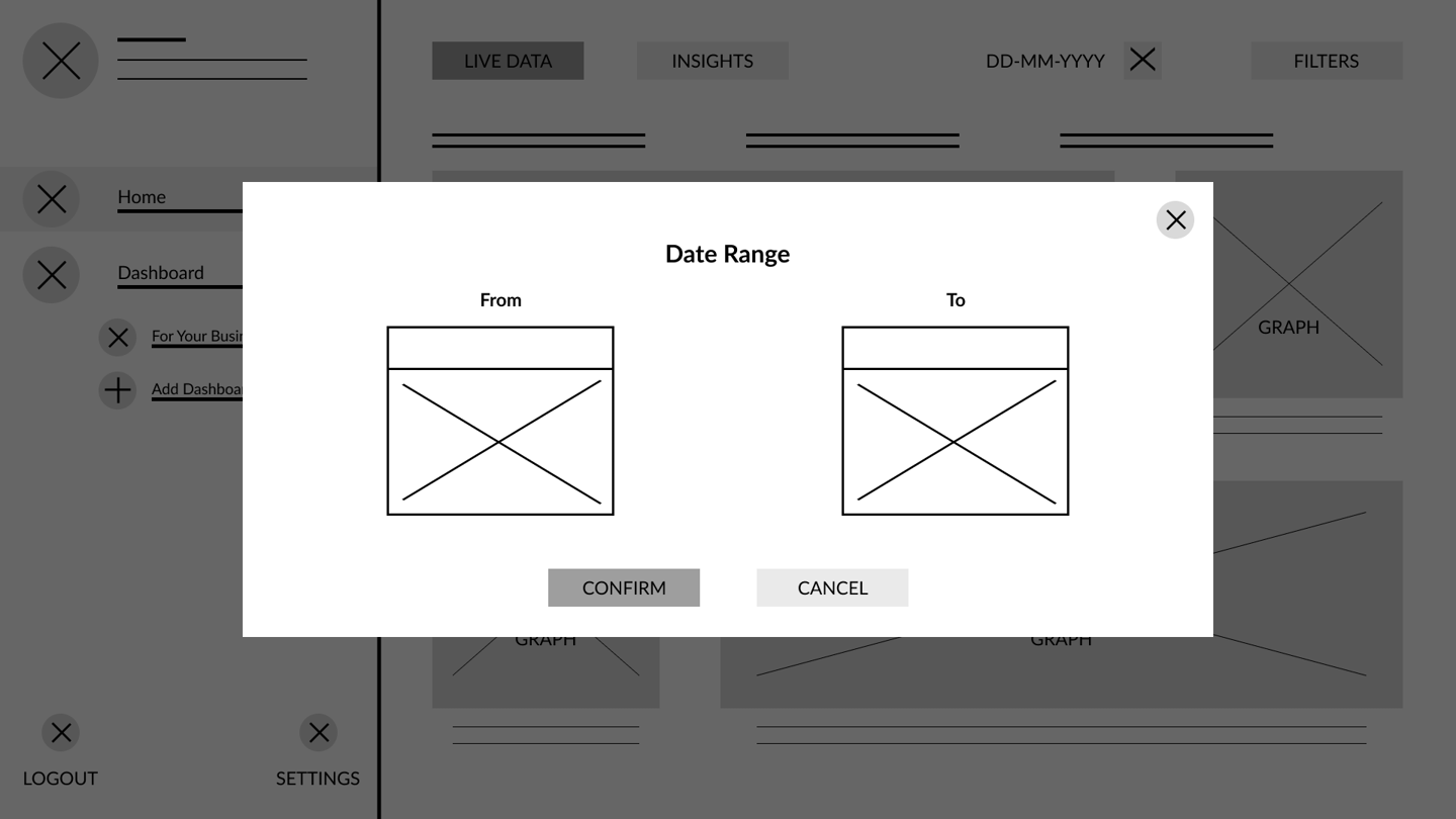
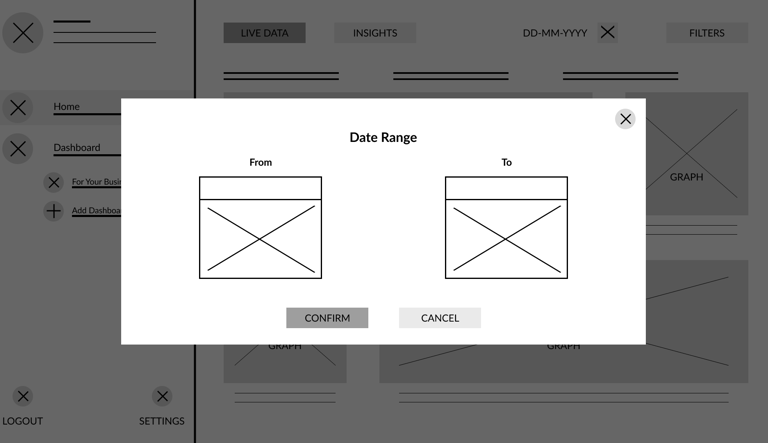
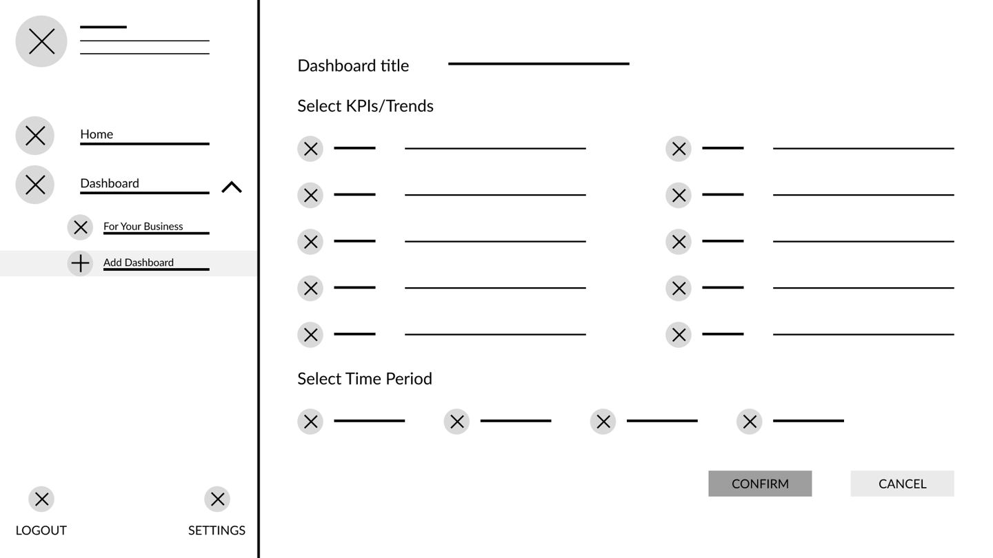

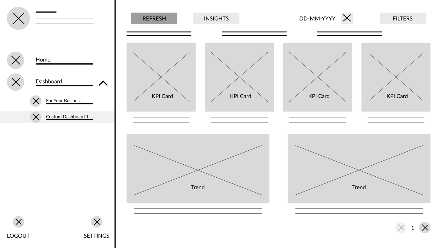
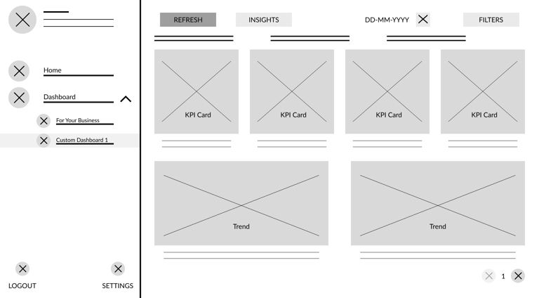
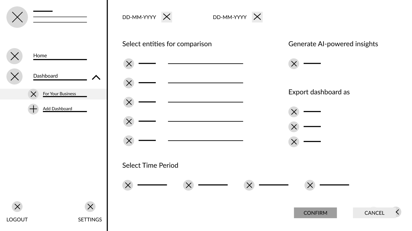
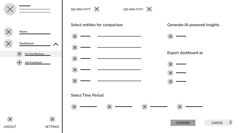
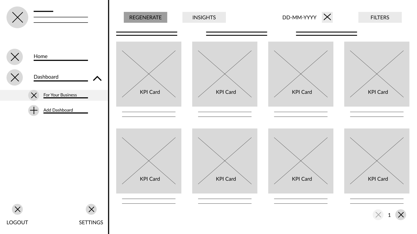

LOGIN
HOMEPAGE
STORE FILTERS
DATE FILTERS
ADD CUSTOM DASHBOARD
VIEW CUSTOM DASHBOARD
FOR YOUR BUSINESS - PARAMETERS
FOR YOUR BUSINESS
FINAL RESULT
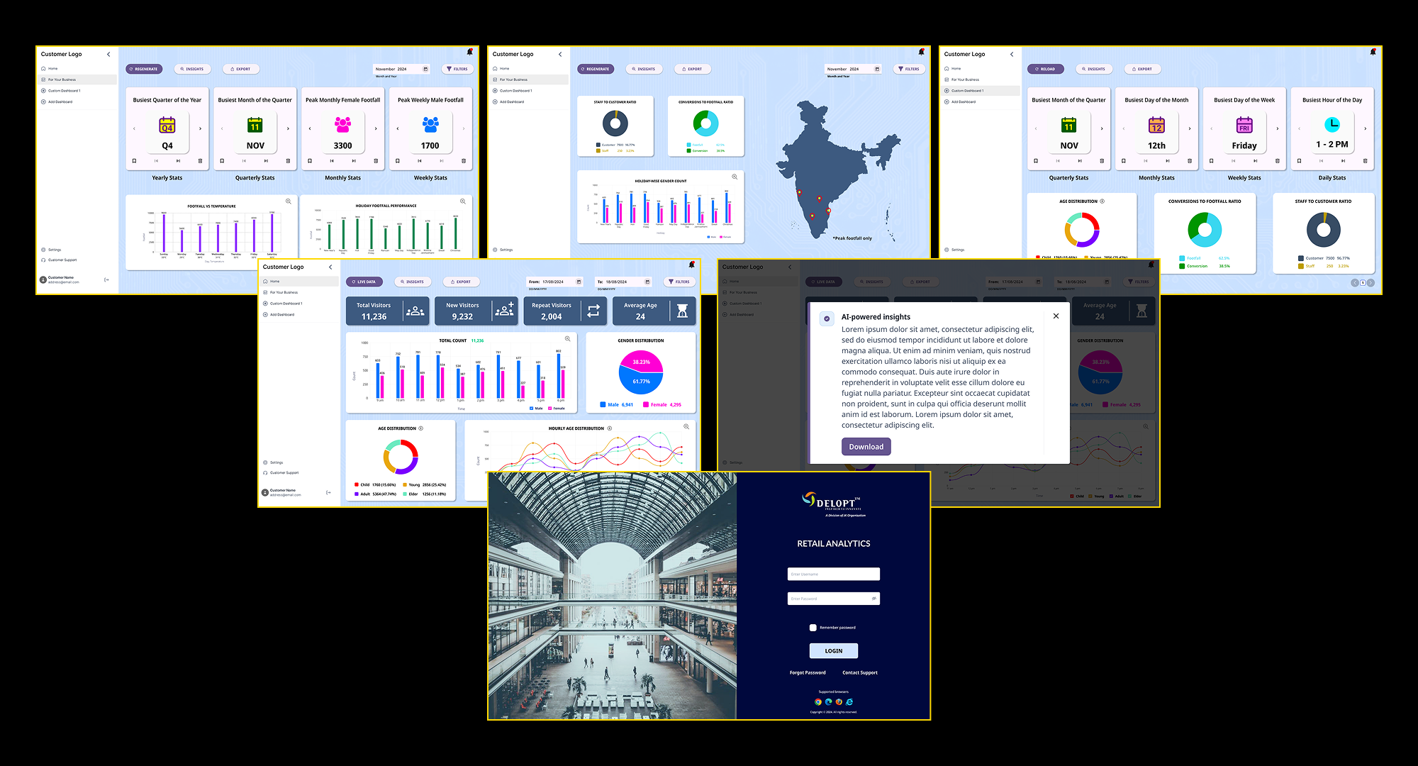
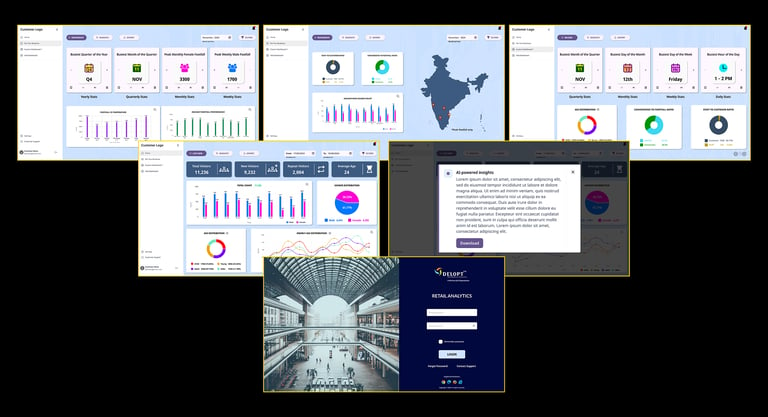
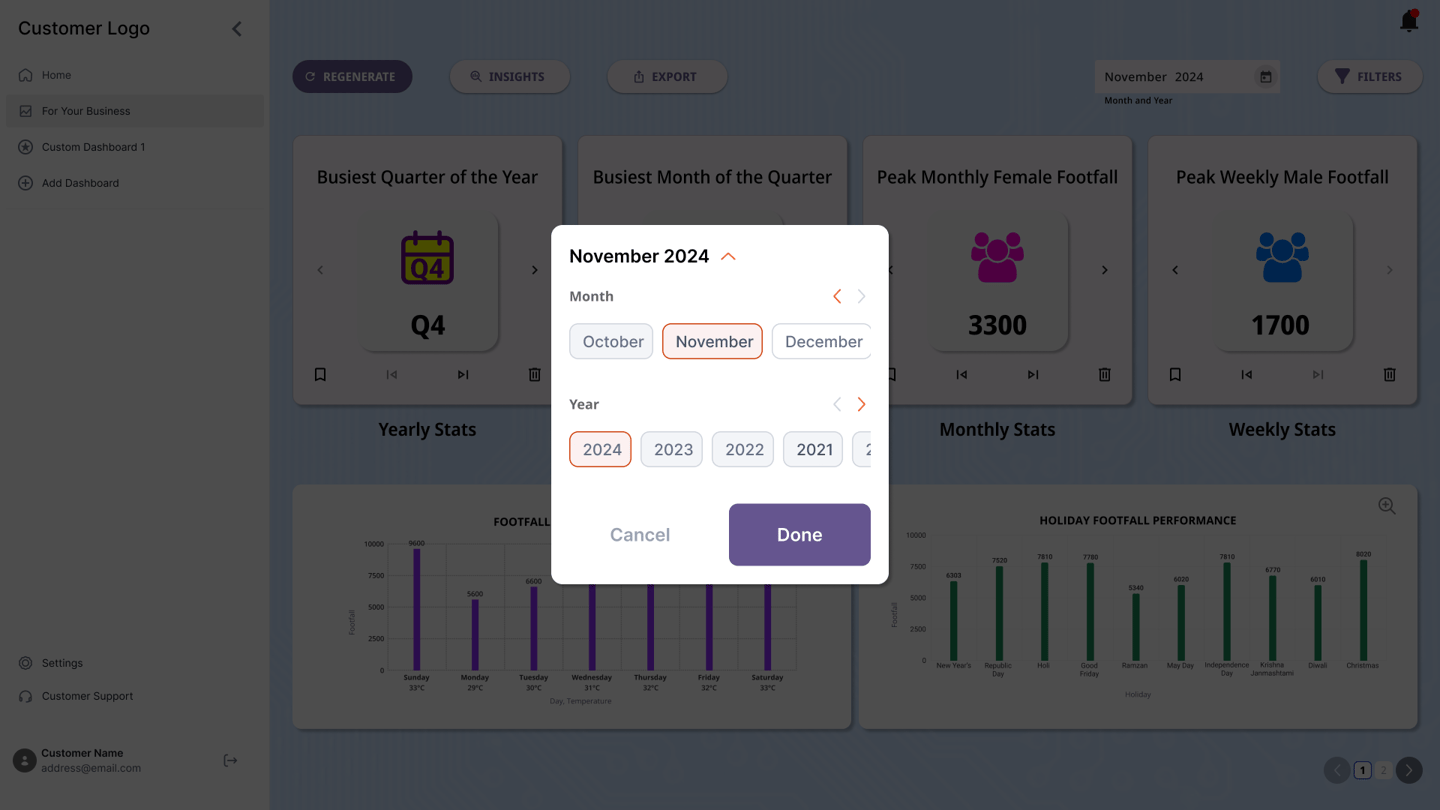
Upon multiple iterations of the wireframes and prototypes, the final mockup was completed. There were suggestions from customers as well as the development team regarding the user journey. Appropriate changes were implemented accordingly.
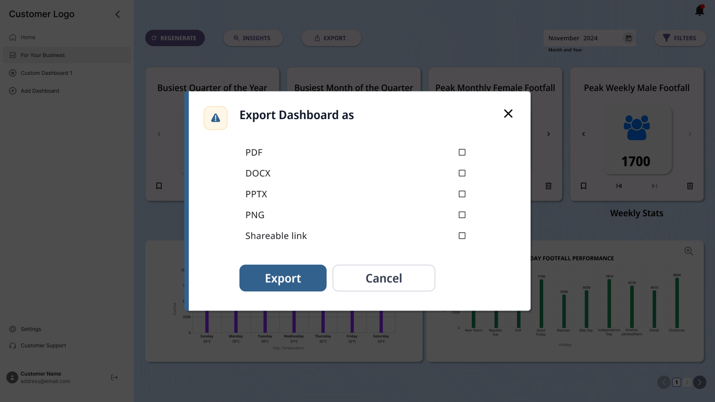
Additional options such as exporting the dashboards to a viewable link or a downloadable file were also included. Users were also provided an option to regenerate insights while saving the previously generated insights as a backup. The users were also provided an option to download the insights for sharing.
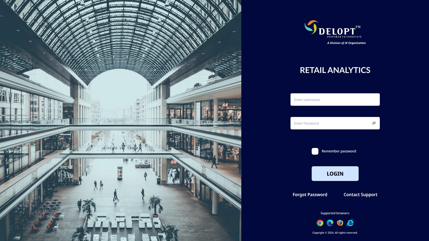
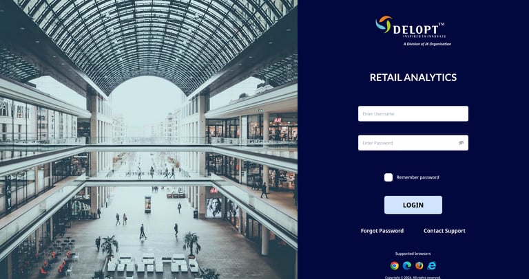
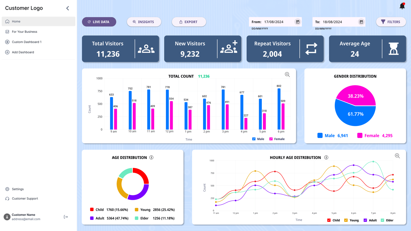

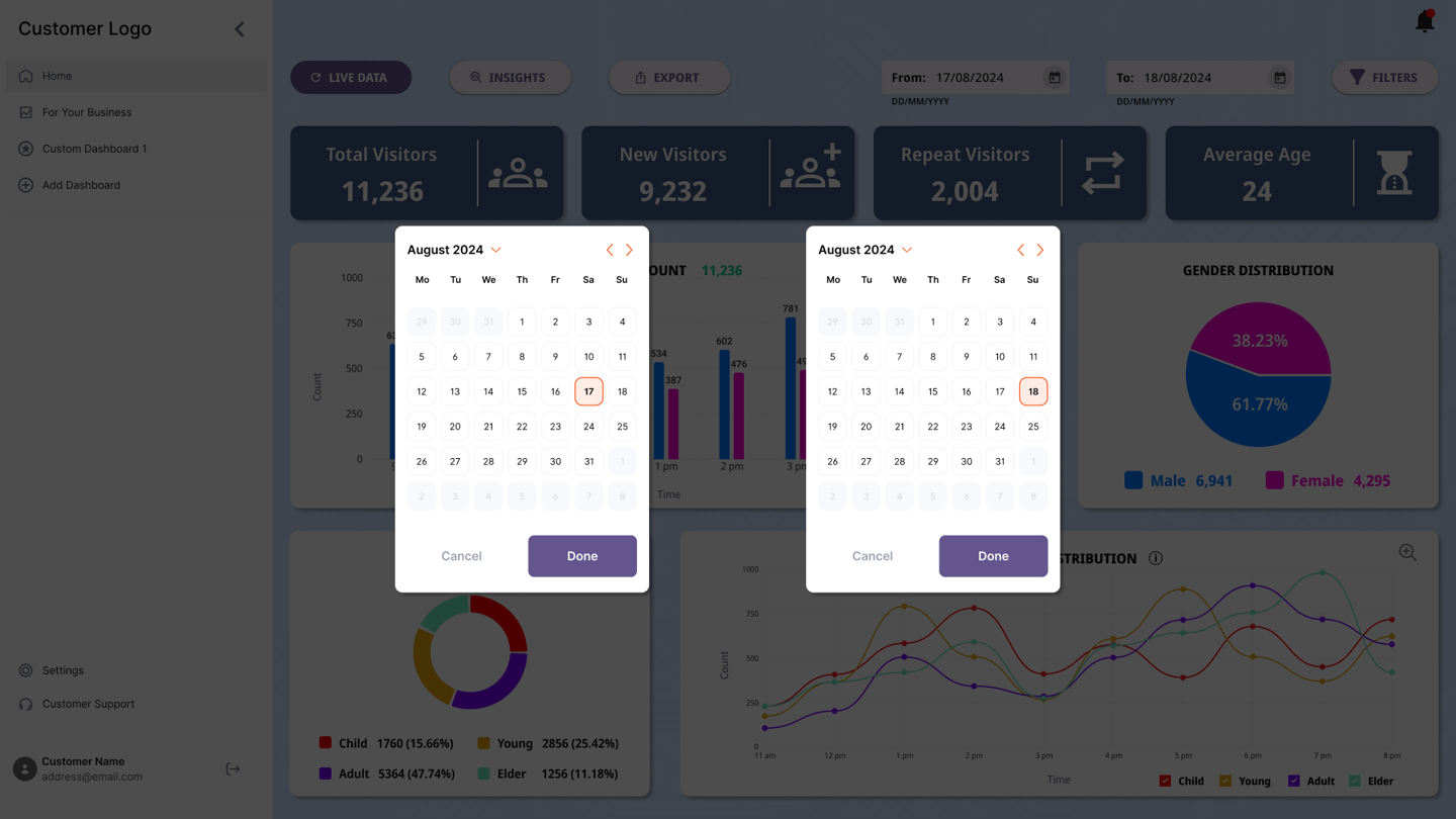

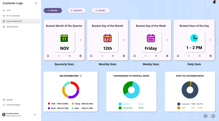
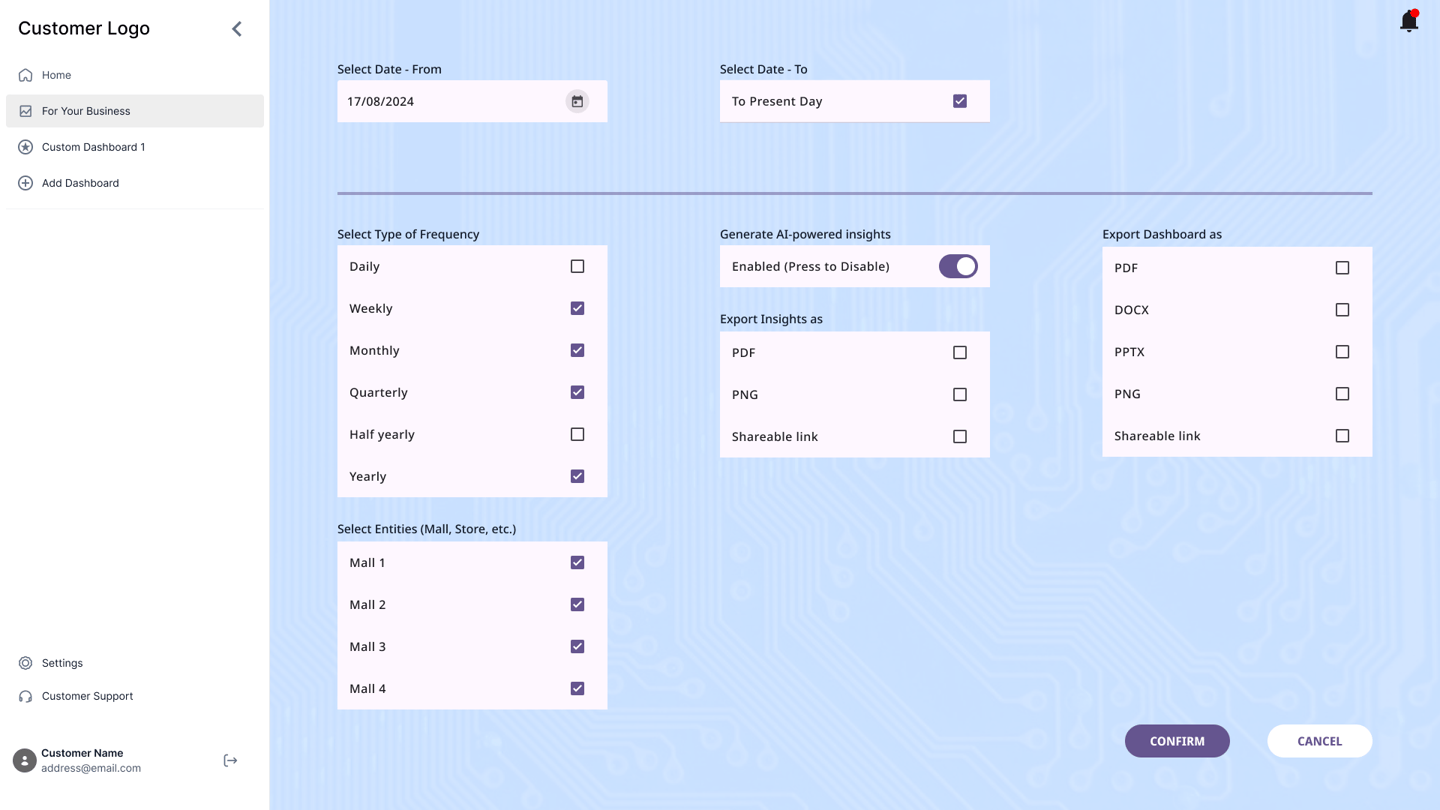

LOGIN
HOMEPAGE
DATE RANGE FILTER
MONTH FILTER
ADD CUSTOM DASHBOARD
VIEW CUSTOM DASHBOARD
FOR YOUR BUSINESS - PARAMETERS
REGENERATE PERSONALIZED INSIGHTS
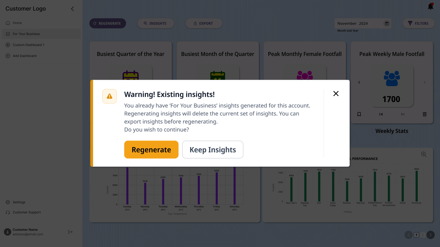

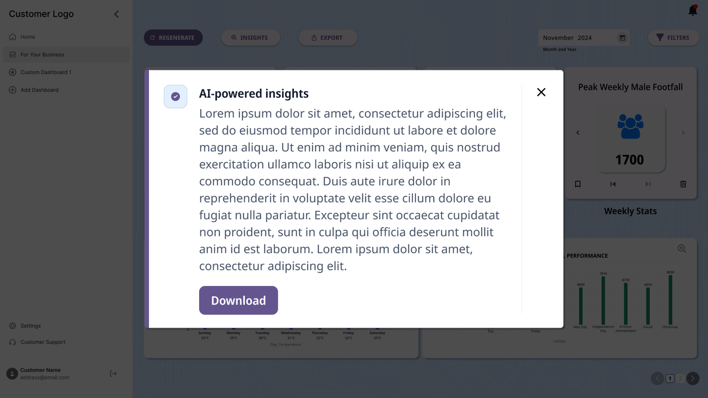
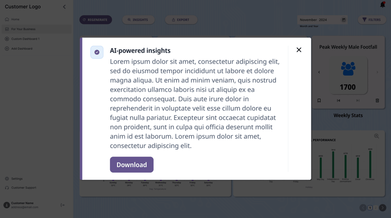
VIEW INSIGHTS
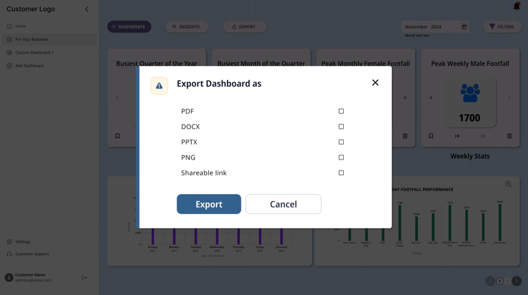
EXPORT DASHBOARD


FOR YOUR BUSINESS
TAKEAWAYS
The usability studies showed the preferences of customers with regards to metrics, representation of data, and ease of use.
The research showed the drawbacks of the current platform and guided the development cycle for the next iteration.
The usability studies indicated that users feel positively impacted with respect to AI-assisted features as it makes their life easier.
The users were pleased with the addition of more metrics to monitor.
The users appreciated the customization provided with respect to adding custom dashboards.
The users found the readability acceptable. However, a dark mode feature was requested by some. This is in the plan for the next iteration.
The export button for the dashboards, and the export option for the insights were appreciated by the users.
NEXT STEPS
Implementation of accessibility features (dark mode, screen reader support, etc.)
Additional metrics that can be derived from footfall data in combination with commercially available APIs with respect to retail businesses.
AI-generated summaries in the downloadable reports.
Bhargav Sundara Rajan
Feel free to add me on LinkedIn or reach out via email for potential job opportunities, inquiries, collaborations, or just feedback in general.
Please let me know if you found me through this website! :)
