DELOPT Retail - Website Redesign
30+
Retail brands and malls
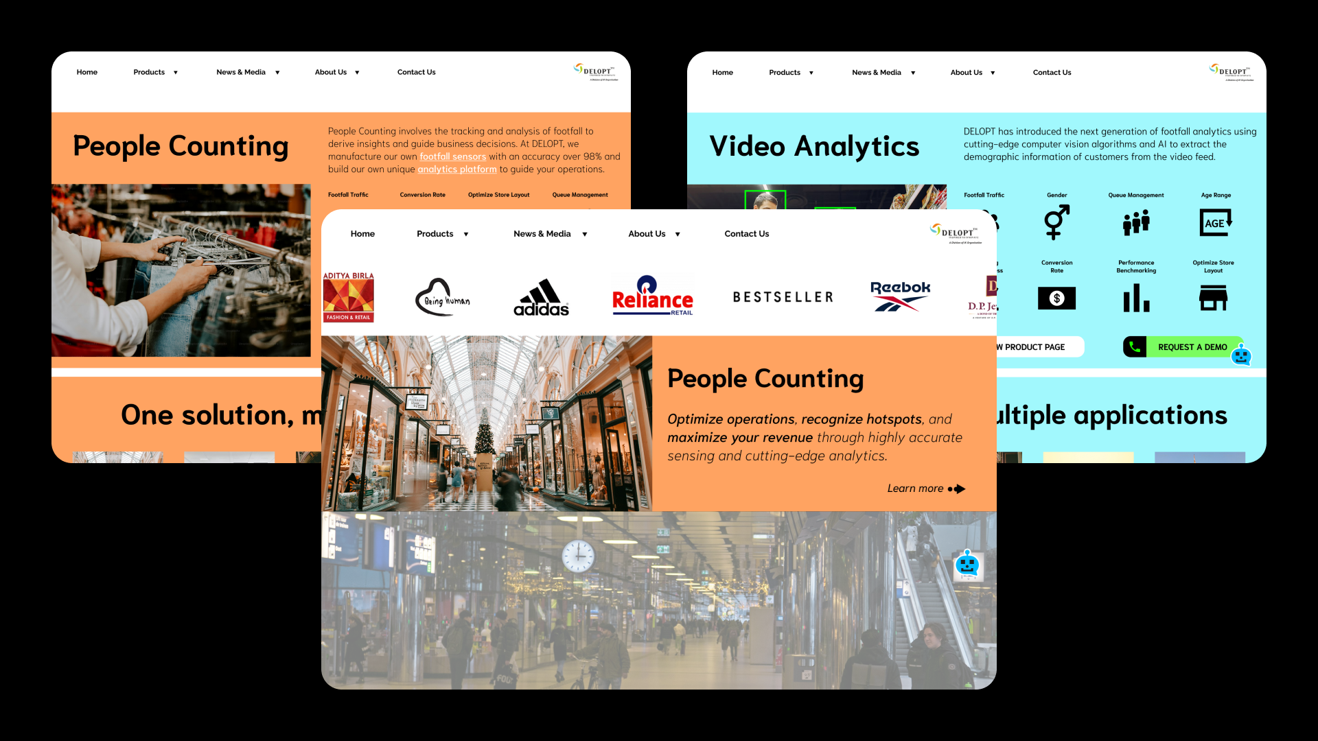

PLATFORM
INDUSTRY
Commercial retail
Web & Mobile
8000+
Sensors deployed across world
TLDR;
OVERVIEW
A reimagining of the DELOPT retail division website. The current website is mostly showcasing the Defense division and does not represent the retail division appropriately. Therefore a separate showcase for the retail products and services has been created.
DURATION
04/2024 to 05/2024 (1 month)
ROLE
Associate Product Manager, UX Lead
RESPONSIBILITIES
User research, user journey, user flow, visual design, wireframing, prototyping, user testing
PROBLEM
The current DELOPT website has more details about the defense division and approximately a single page for the retail division. In addition, the content is mostly text with limited images and composition of content. There is a need for a separate color palette, typography, and information architecture to represent the Retail division's products and services. There is also a lack of content regarding the use cases and applications for the products.
REQUIREMENTS
Homepage
People Counting landing page
Footfall Sensors - landing page, product pages, applications, success stories
Video Analytics - landing page, product pages, case studies
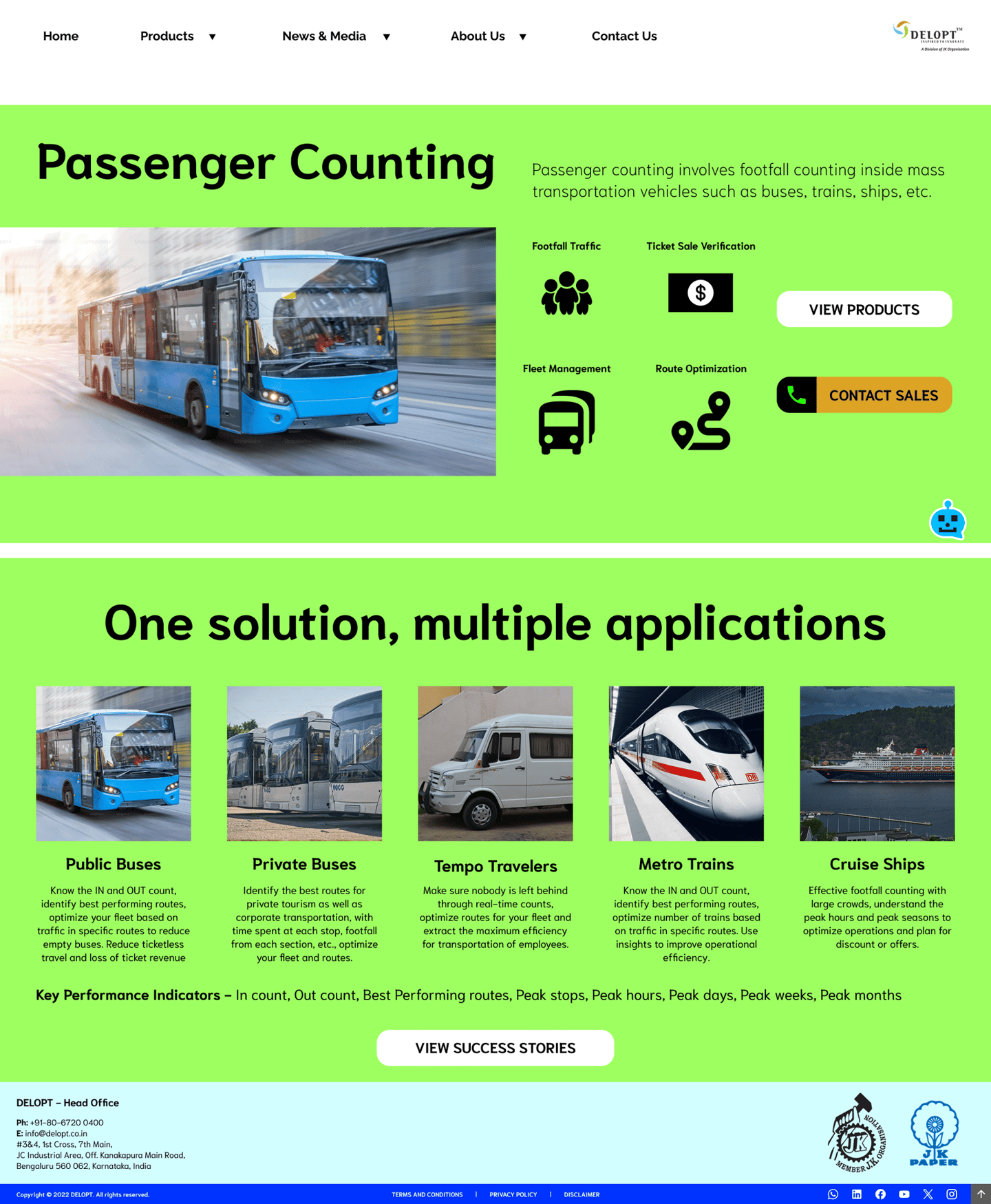
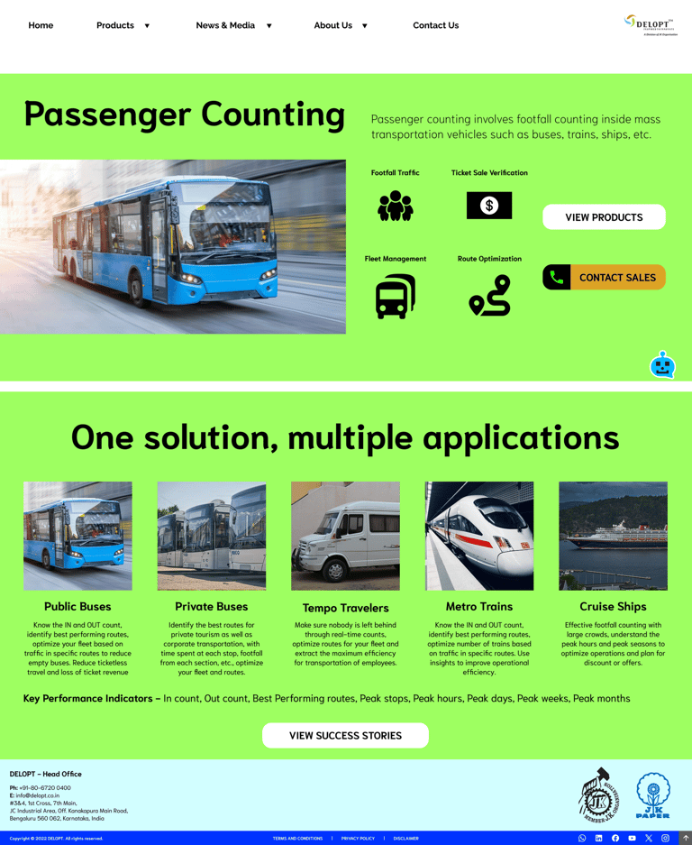
Passenger Counting - landing page
Chatbot
Newsletter sign-up pop-ups
GOALS
Create a distinct hierarchy of information to be displayed
Create a custom color palette with separate colors for each major category of products
Utilize a unique typography that matches the deliverables of the products
Create unique and distinct descriptors for the landing pages
Use unique icons/graphics to represent the functions/features of the products and services
Use CTA buttons where necessary to guide users, for analytics, and usage heat maps
Display the most prominent customers to showcase the performance of DELOPT in the retail footfall counting industry
PROBLEM STATEMENT
DELOPT is a retail and defense tech company owned by JK Paper, a part of the JK Group conglomeration. The retail division of DELOPT focuses on monitoring the footfall in retail stores and malls, to help management identify visitor patterns and plan their business accordingly. The current website includes both the defense and the retail divisions but mostly displays the defense division, with a single page for the retail division. The content for the division is mostly outdated text with a couple of images and one promotional video.
There is a need for a separate identity for the Retail division to address the clients that belong to it. A separate color palette, typography, and information architecture to represent the retail division's products and services are absent. There is also a lack of content regarding the use cases and applications for the products to educate potential customers on how DELOPT can help their business.


>85%
Interviewed customers found DELOPT's retail services through word of mouth, sales partners and not through the website.
IDEATION & RESULTS
The concept involved using colors familiar to the DELOPT brand logo, but not conforming to the exact colors so as to provide the division its own identity while also being a part of the family. Distinct color palettes were designated for each industry the products belonged to - People Counting, Video Analytics, Passenger Counting. The typography used is the Niramit font family - a font that is both bold and modern while retaining the sense of tradition, something that resembles the path DELOPT is embracing in their journey towards excellence.
Color Palette
Typography
NIRAMIT REGULAR
NIRAMIT SEMI BOLD
Aa
In addition to the color and typography, a relatively new approach to representation of information was chosen. Something the previous website did not provide was proof that DELOPT is reliable in the industry for retail footfall analytics. Therefore, a display of our top customers on the homepage in the form of an infinite scroll was chosen. Multiple pages were also designed for the different types of retail products and services offered by DELOPT with a simplistic representation of features through icons.
Another thing that the current website lacked was case studies and applications of the DELOPT retail products in different industries, which has been included in the current concept.
Based on continuous feedback with stakeholders, the final pages and features that were decided are as follows:
Homepage
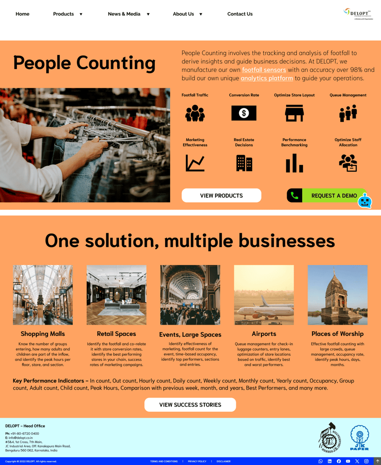
People Counting landing page
Footfall Sensors - landing page, product pages, applications, success stories
Video Analytics - landing page, product pages, case studies
Passenger Counting - landing page
Chatbot
Newsletter sign-up pop-ups
CTA buttons
HOMEPAGE
CUSTOMER LIST INFINITE SCROLL
NIRAMIT ITALIC
NIRAMIT BOLD
Aa





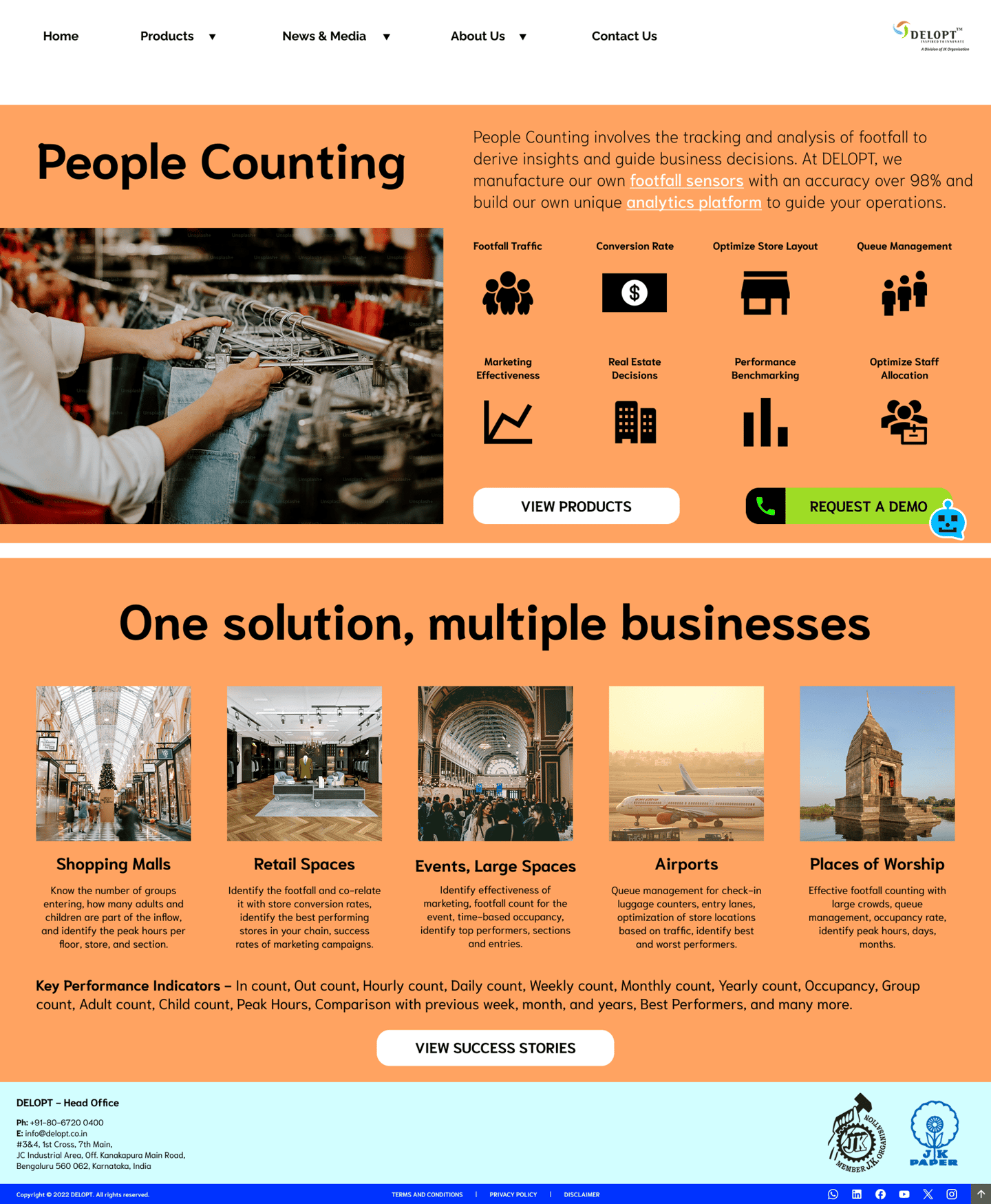
HOMEPAGE EXPANDED
PEOPLE COUNTING

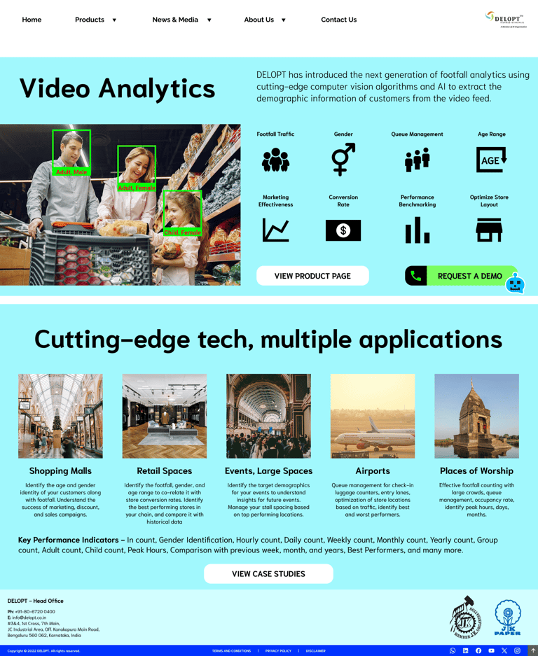
VIDEO ANALYTICS
PASSENGER COUNTING

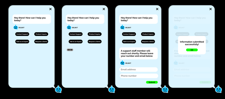
CHATBOT - DELBOT

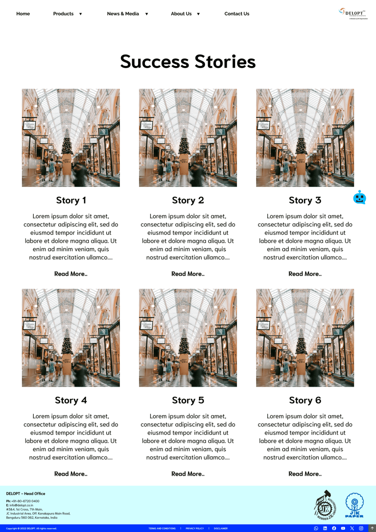
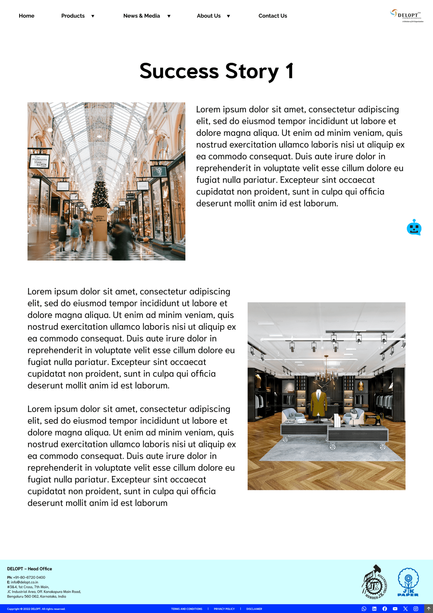
SUCCESS STORIES
SUCCESS STORY PAGE FORMAT

TAKEAWAYS
CTA buttons and individual pages were appreciated since it provides more usage data and heat maps.
The color palette and typography chosen tested well with internal and external stakeholders.
A dark mode feature was requested by some users.
NEXT STEPS
Implementation of accessibility features (dark mode, screen reader support, etc.)
Improvement of technical language used in some cases.
Bhargav Sundara Rajan
Feel free to add me on LinkedIn or reach out via email for potential job opportunities, inquiries, collaborations, or just feedback in general.
Please let me know if you found me through this website! :)
